Imprint Tattoo Aftercare
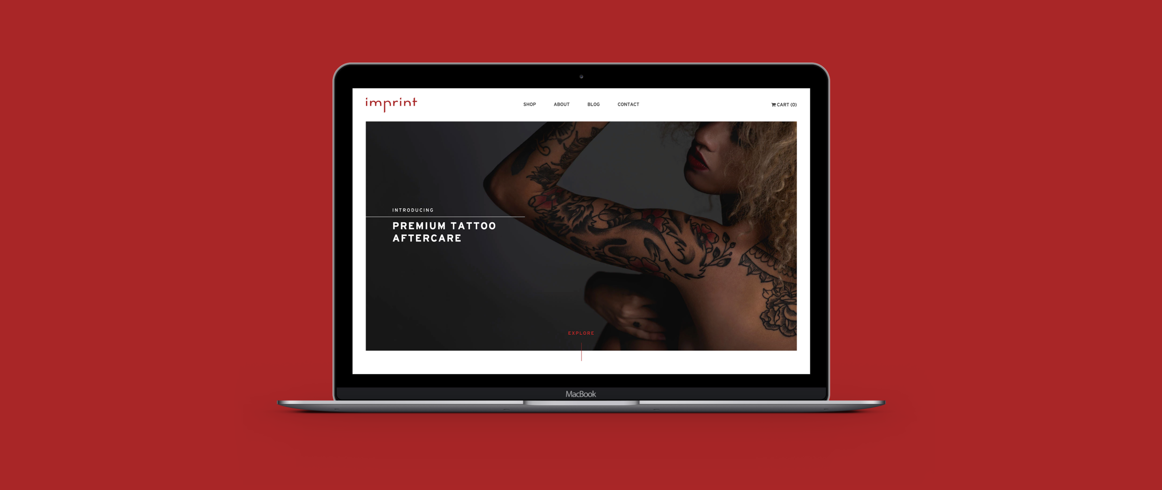
Responsive E-commerce site
Challenge
There are only a few tattoo aftercare lotions in the market and most of the options are targeted to the average tattoo client. Imprint Tattoo Aftercare is a passion project of mine that turned into a business in real life. We wanted to introduce a product for tattoo artists, shop owners, and higher-end clientele who prefer premium quality.
Approach
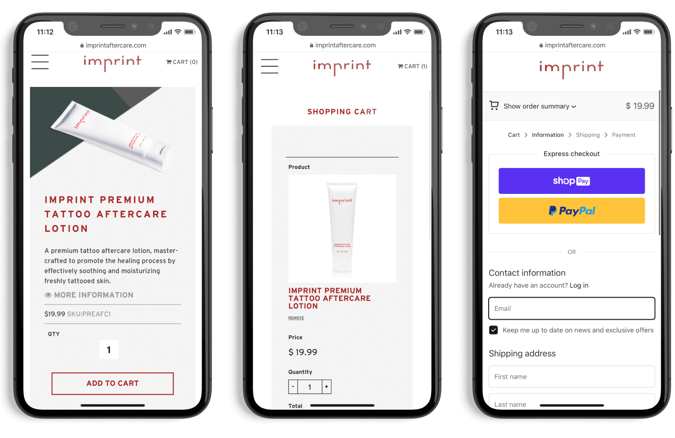
We created a custom-built website that had information about the product and company. The customer could purchase the aftercare lotion through an easy process that was created by using Shopify. This provided a simple payment process for the customer and a great management tool to fulfill orders for Imprint.
My Role
UX Designer and Visual Designer
Created information architecture, wireframing, prototyping, applied design, user testing, and collaborated with development team.
My Deliverables
Information Architecture, Interface Design, Personas, User Research, User Flows, Prototyping, Visual Design, Wireframing, and Brand Design
My Tools

Discovery
After learning about Imprint Tattoo Aftercare, the lead designer and I realized there was a gap in tattoo aftercare. The majority of tattoo aftercare lotions are poorly designed and their websites had a bulky approach. We wanted to create a streamline experience and a brand that is easily translated through print and digital media.
We identified 3 key proto personas through our workshop, them being: Tattoo enthusiasts, tattoo shop owner, and tattoo warehouse vendor. These 3 individuals would interact with the brand through tattoo conventions, tattoo shops, or searching for it online.

Storyboard
To have a better understanding of our proto personas and initiate awareness about the brand, we created storyboards that defined how they would interact with Imprint Aftercare.
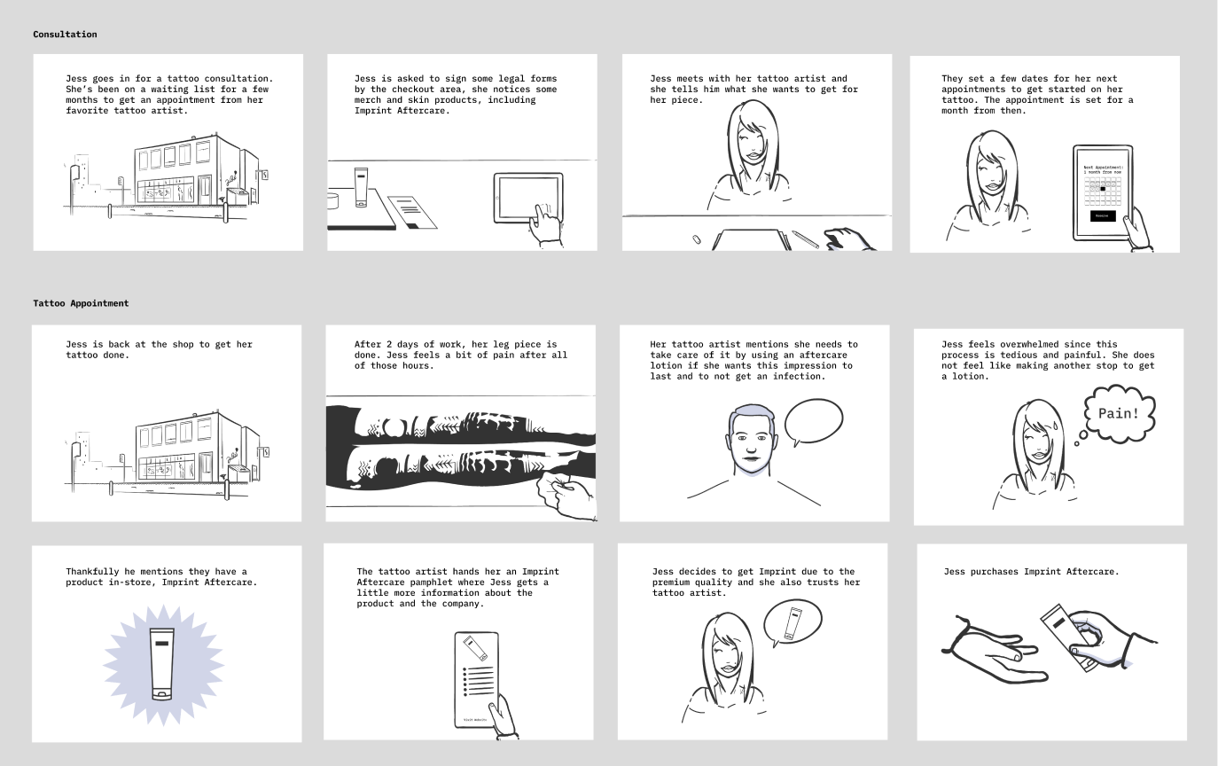
Partial storyboard for tattoo enthusiast proto persona.
Experience
While we architect the website and created wireframes, we identified these components vital for the website:
- Home page — Intrigue customers about Imprint and the product.
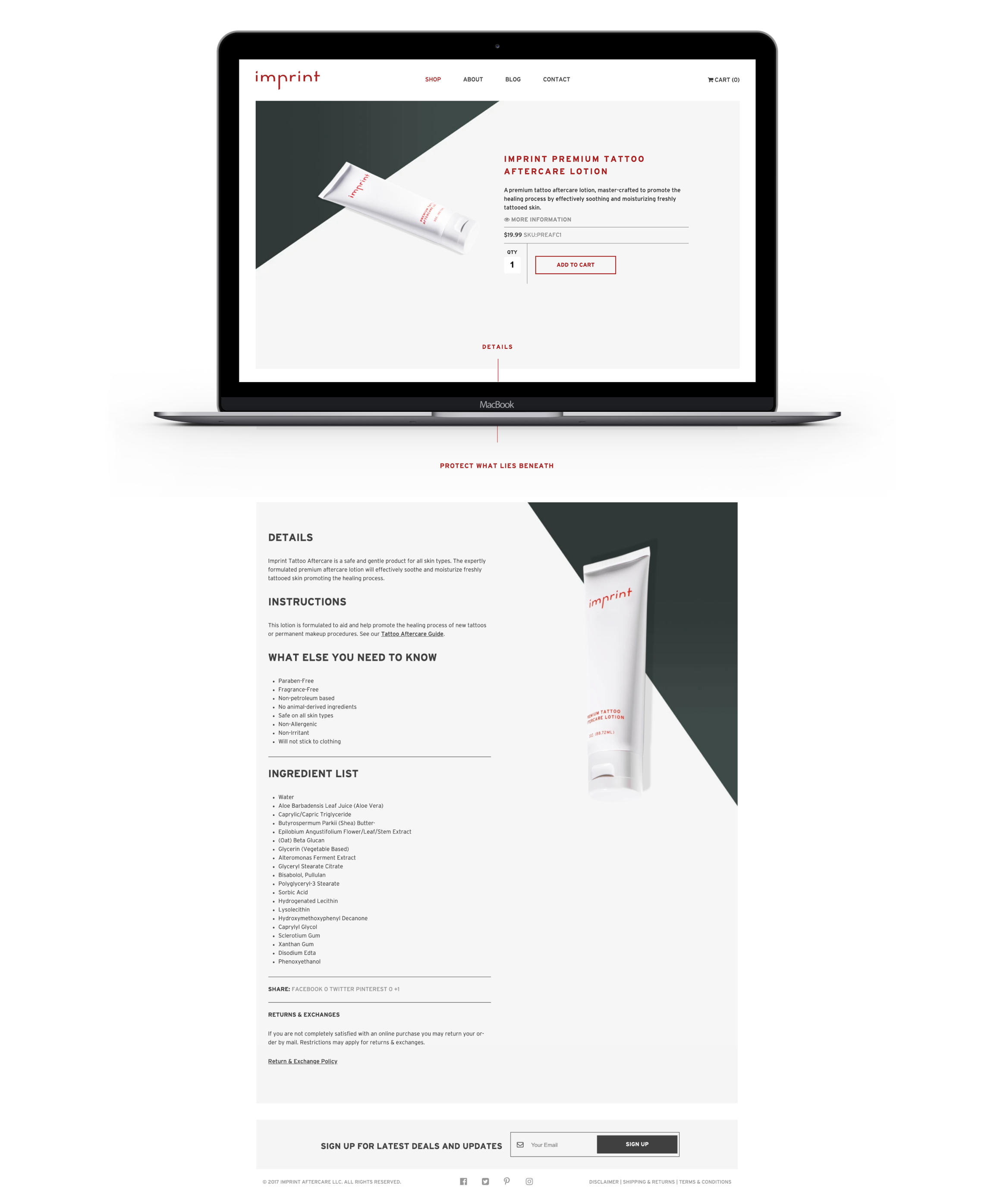
- Shop page — this page gives details, instructions, ingredient lists, and provides the ability to purchase the product.
- benefits of the product. It also provides the ability to begin the purchasing process.
- About page — promotes company mission and ability to purchase the product.
- Blog — highlight foundational information about tattoo aftercare.
- Contact — a form to contact the Imprint team.
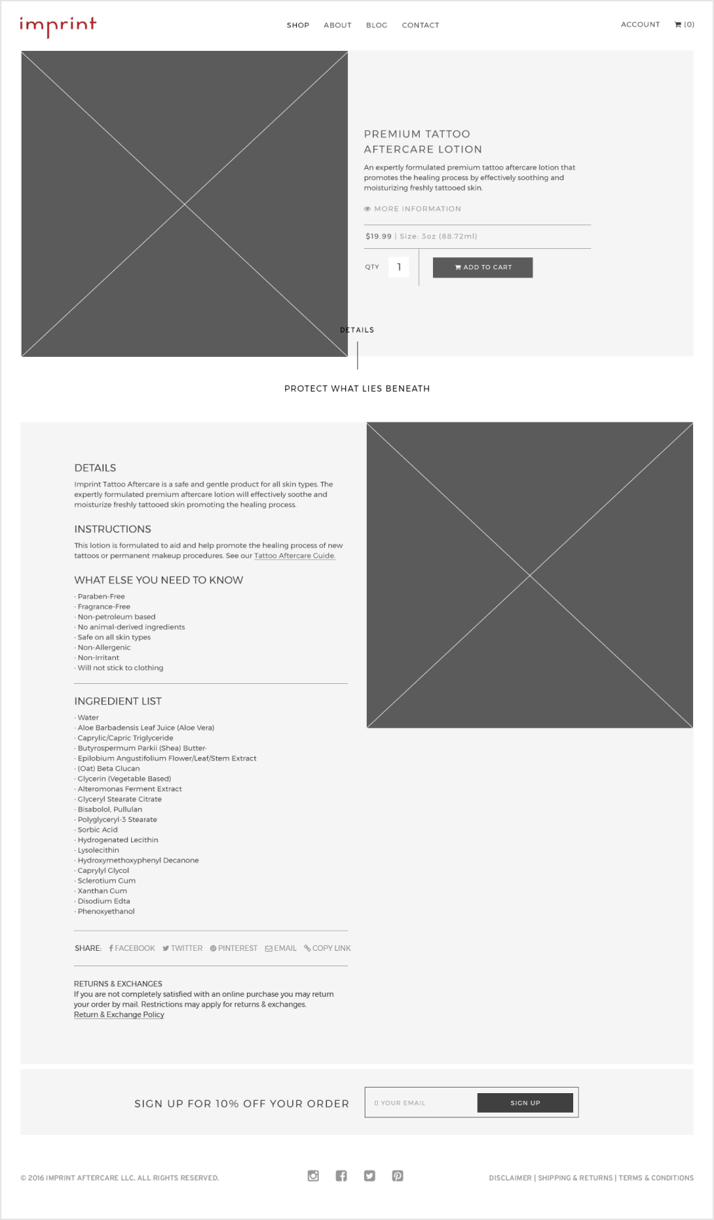
Shop page for Imprint Wireframe.
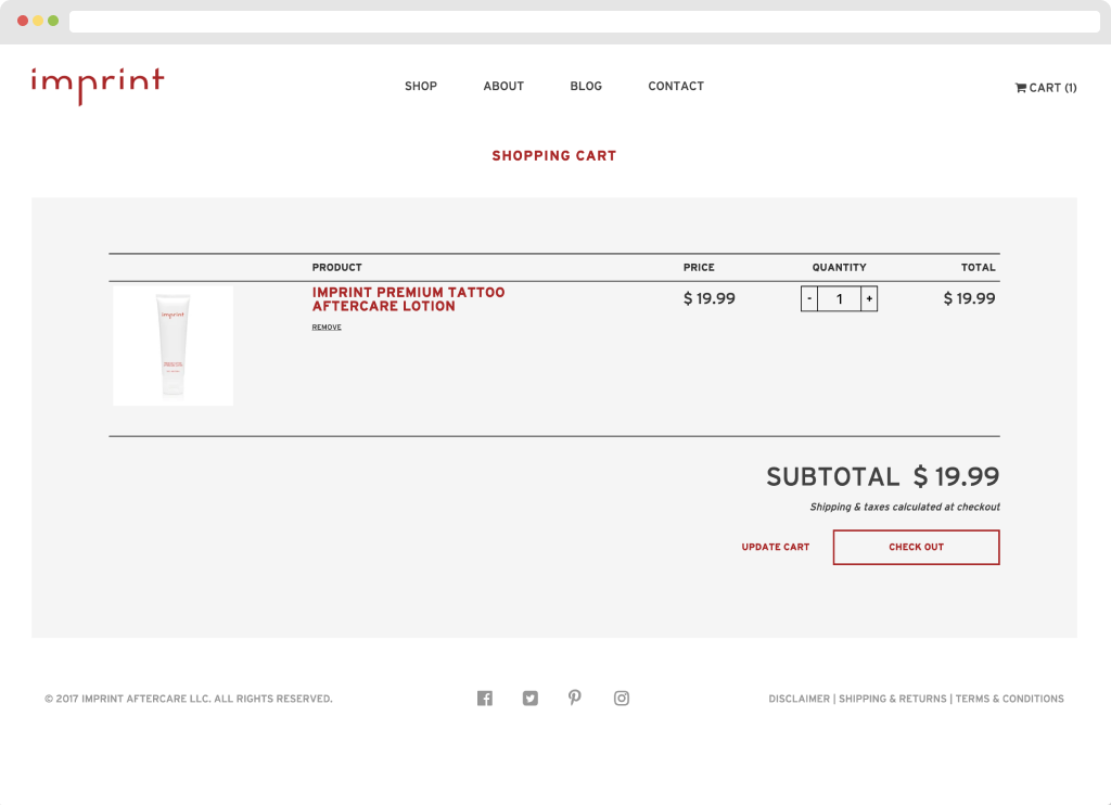
Cart page created through Shopify.
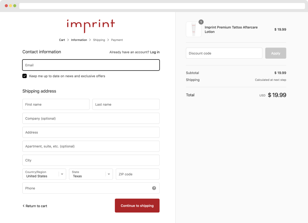
Purchase process for imprint.
UI Implementation
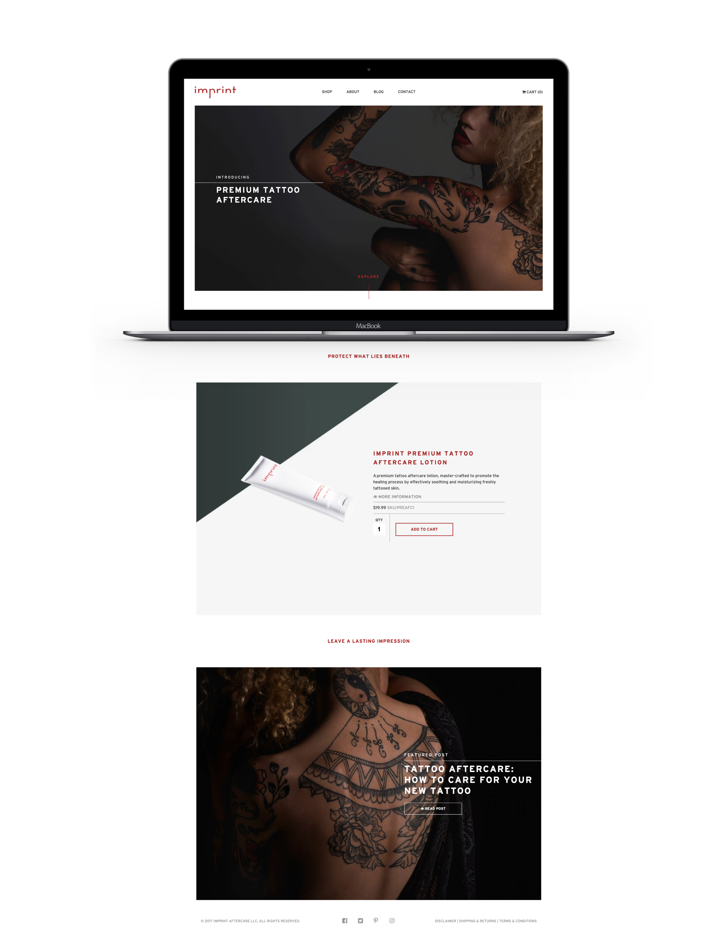
The UI has a very clean approach with minimal colors and stern typography. The imagery implemented was captured to create most of the substance and carry a premium aesthetic vibe. The color palette consists of 3 colors:

Typeface
The font for Imprint needed to have some edgy and prestigious authority. We picked Interstate as the typeface due to its great legibility in print and digital assets. The brand has a very bold and tasteful look with the combination of all of these UI components.

Final Thoughts
Even though I have contributed to e-commerce sites before joining the Imprint Aftercare team, this was my first time researching and creating all components through the entire process. We did research in-depth, created wireframes, prototyped, designed, photographed, and built. I’ve seen great success and it’s great to know that individuals appreciate a product of this quality.

